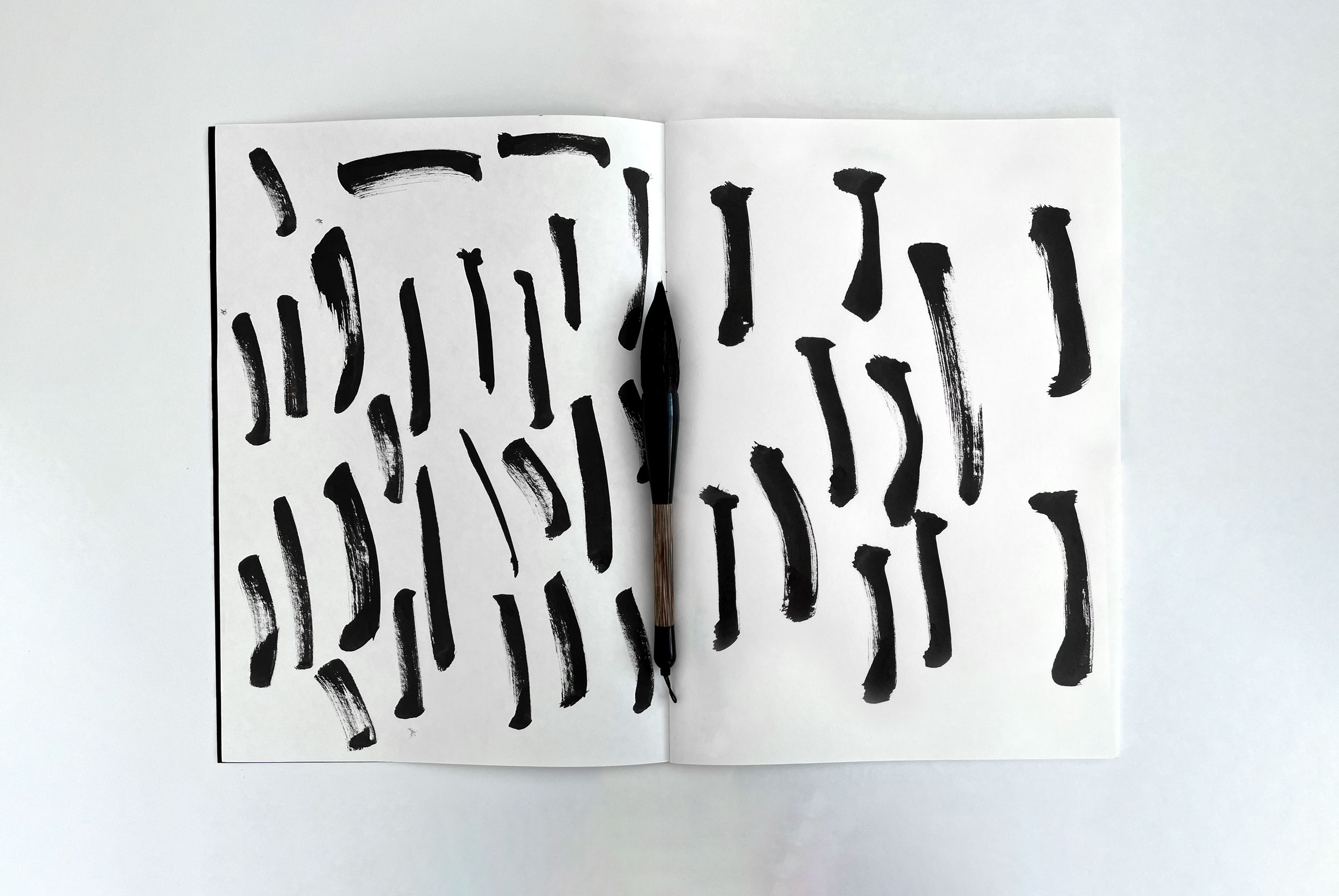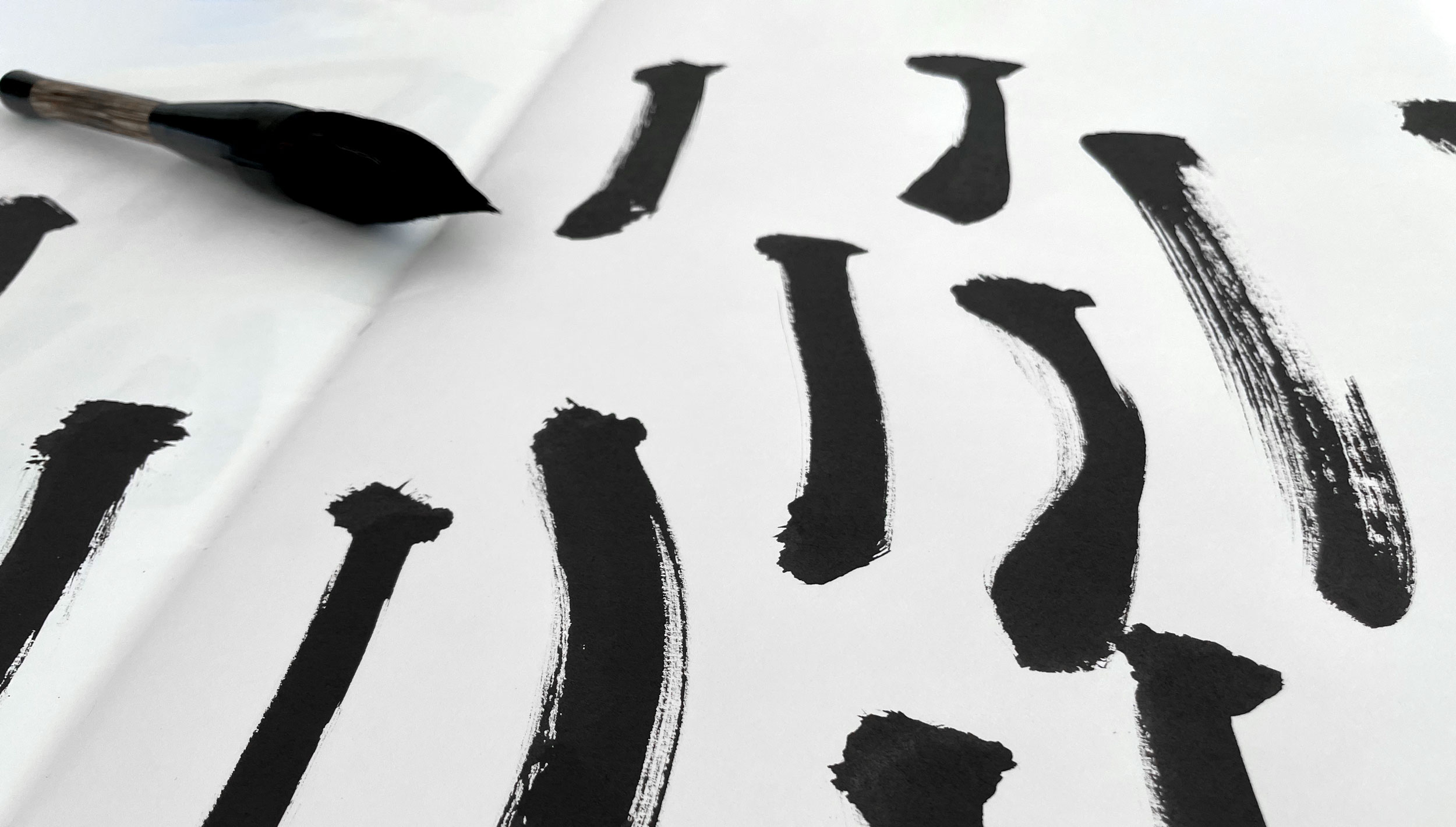
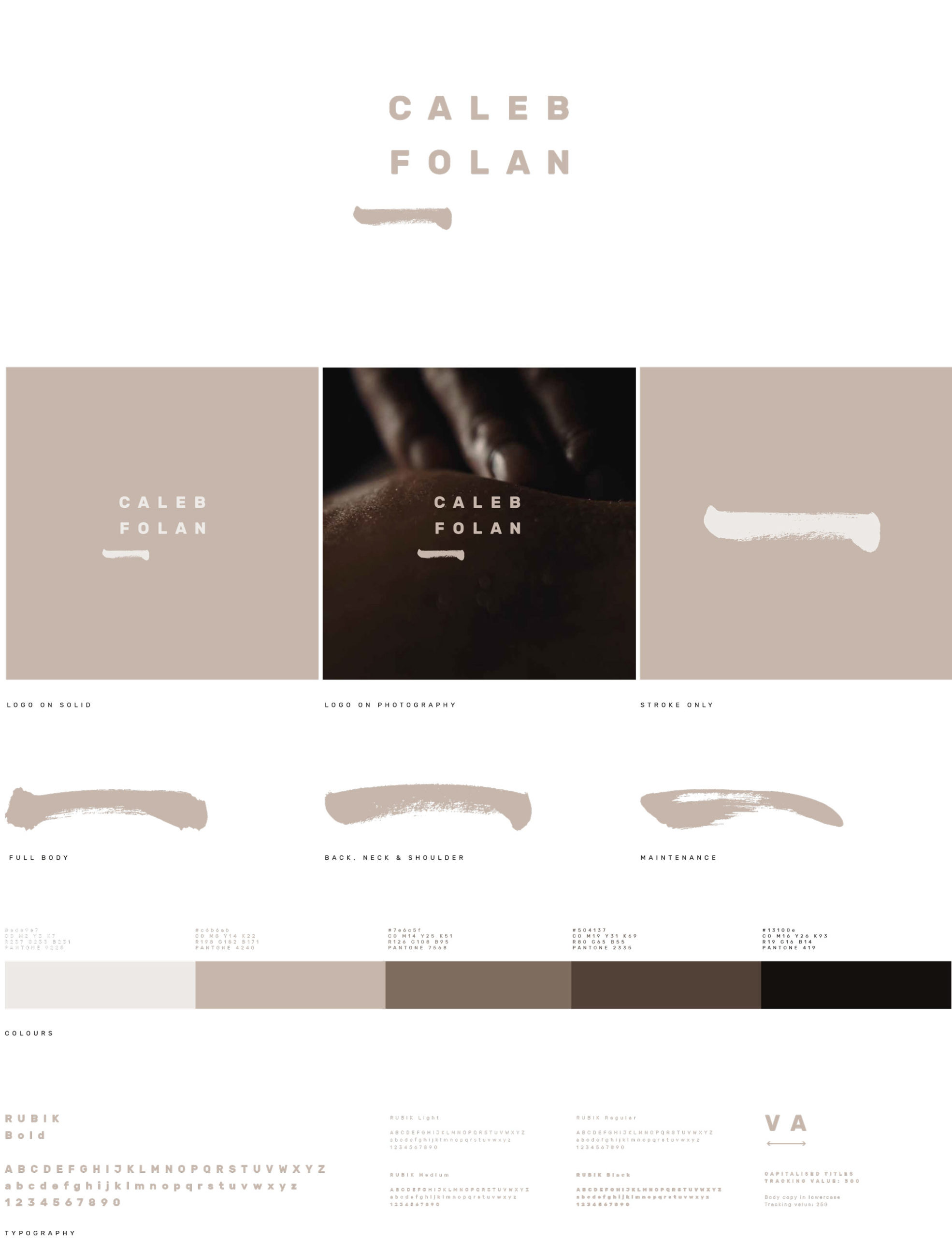
The brand identity was born out of the similarities of massage and calligraphy techniques. Caleb explained that variance of pressure in drawing a brush stroke for the Chinese character for the number 1 felt akin to that of finding and relieving tension within the body.
Using a Chinese calligraphy brush and black ink; a range of brush stroke marks were created to use throughout the visuals. We often seek massage for correction and to reset physically, so it felt natural to intentionally misalign elements of the designs, but in a way which still felt ‘right’. As a result this sense of offset harmony was included throughout the identity development.
